Logo Design
A logo is the face of a brand, and it is a real pleasure to get to explore and develop a brand identity and sculpture its most visible part. By capturing company values and intentions, I can create a logo that speaks your language, to your intended client.
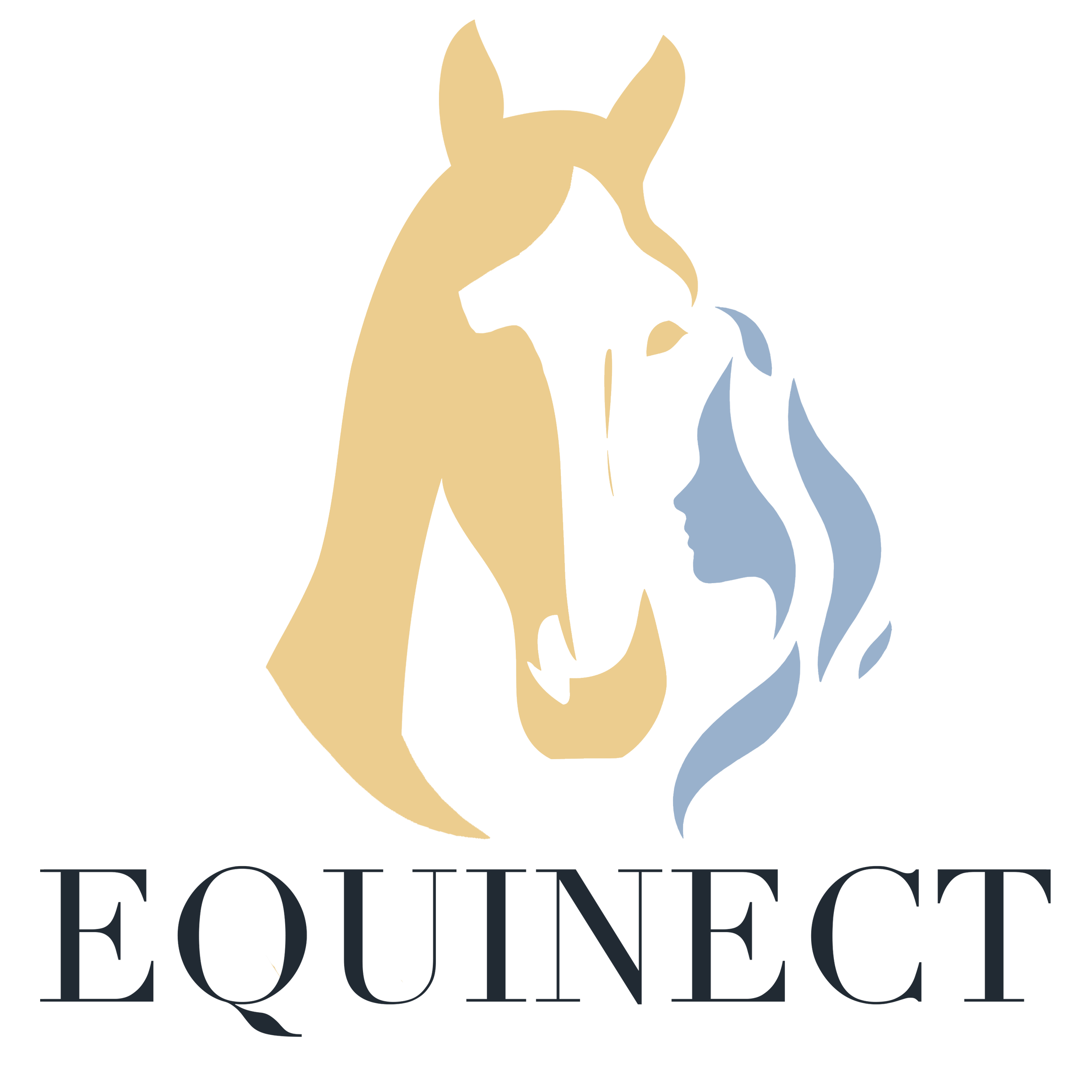
Equinect creates products and courses for people who wants to connect better with their horses. It is a mix between self-reflection and development, along with true horsemanship, where you involve the horse in your therapy.
It was important that the logo reflected upon this connection between horse and human, using a soft style of image, and colors that are calming and grounded.
Equinect is an upgraded version of Mentala Möten (launched in 2019)
2021
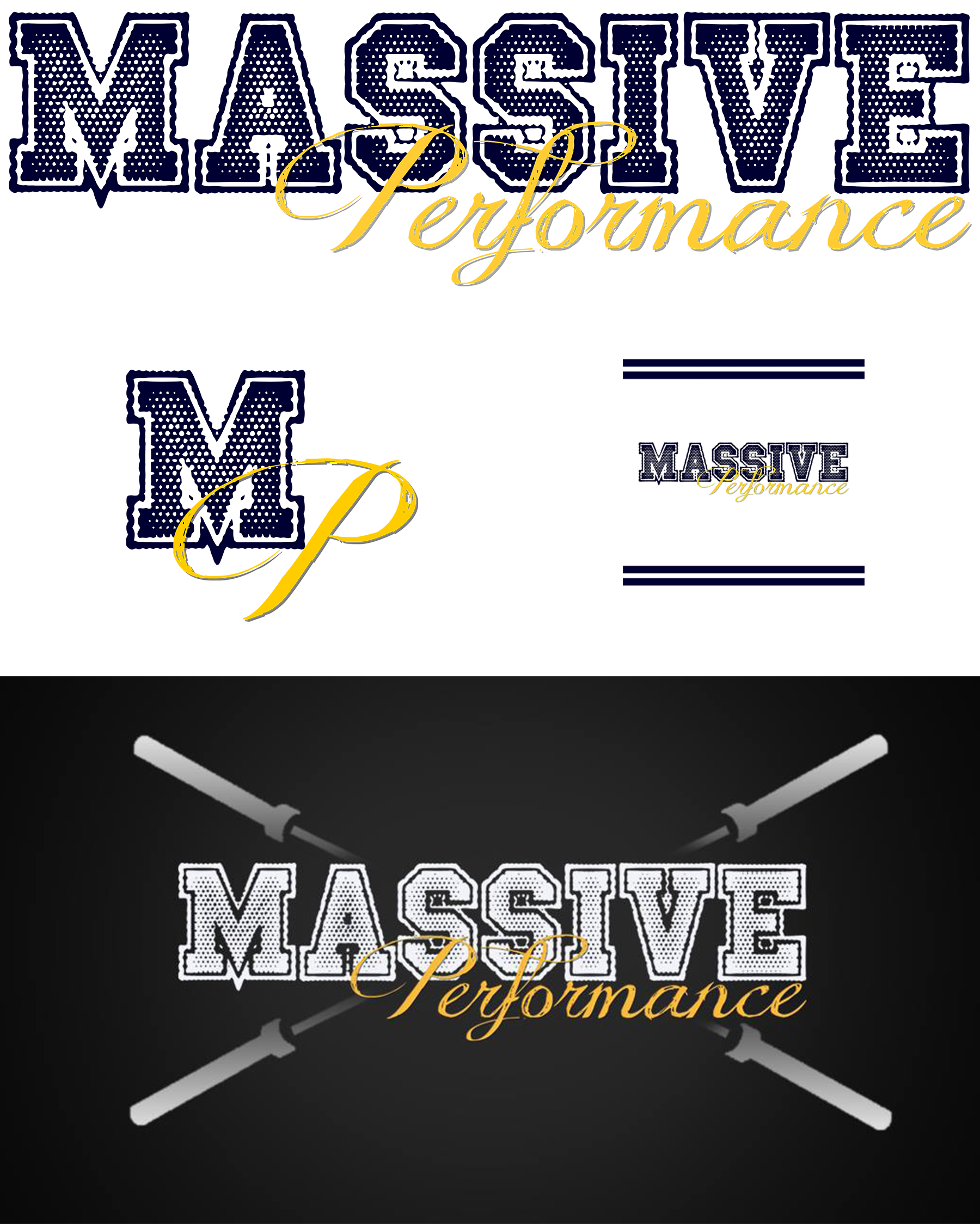
Massive Performance is a training facility for general population, with focus on developing strength both on the inside as well as the outside. They needed a strong logo that could speak to general population clients as well as athletes. By mixing a strong, bold font with a more feminine, soft font, in colors that would strengthen each emotion, we could create a brand that would stand out in a crowd and appeal to both men and women.
The basic text logo can easily be used along with other text or images to promote special training programmes or to attract different clientele. An inverted logo, a favicon and a square version of the logo was also created to make sure the logo would work in any medium.
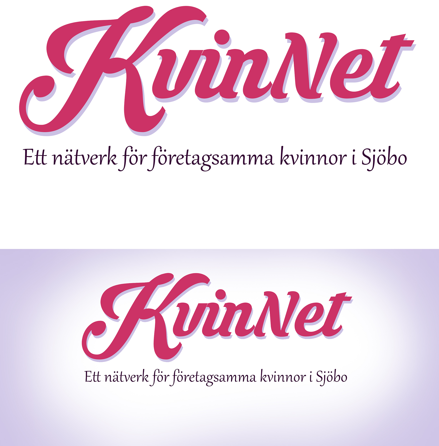
KvinNet is a Swedish networking organisation for entrepreneurial women based in Sweden. They wanted a logo makeover to attract a younger audience, and a tagline to show they weren’t only for CEO’s and founders, but also passionate women working in management or aspiring business women who might not have their own business yet.
We chose to reclaim the color pink and work with a playful font that was eye-catching. The tagline became “A network for entrepreneurial and driven women in business”.
The logo was intended to be used mainly on their website and their social media. To make it more appealing for social media, a purple vignette was added to frame to logo.
Welhalla Group is an innovative company who conducts user experience evaluations in health and healthcare businesses. They needed a strong logo that could tie into the Viking origins, Valhalla. The base of a Valknut, Odin’s symbol, was used to create the W, along with a font that is strong and clear.
The dark blue colors were chosen for their common use in healthcare businesses, and its impression of seriousness. Welhalla takes the user experience to the next level, much like going to Valhall.
Susanna Davidsson from Mentala Motiv is a behavioural coach who works with business men and women, competitive riders and general population. She offers a range of programmes for the her different clienteles.
In spring 2019, Susanna will be launching a new coaching programme, for people who wants to connect better with their horses. It is a mix between self reflection and development, along with true horsemanship, where you involve the horse in your therapy.
It was important that the logo reflected upon this connection between horse and human, using a soft style of image, and colors that are calming and grounded.
Dental Art is a dental technicians lab in Tomelilla. They take pride in making teeth produced in Sweden, in an era where a lot of dental work is being produced in Germany or China.
They required a logo that made it clear to their costumers that the company was based in Sweden, and that was easy to recognise in a jungle of other producers. Choosing a bold font makes the name easy to read on all of Dental Art’s products, like packaging, tape, stickers and invoices, and the colorised Swedish flag makes the logo pop, even in a small size.
Barbelles is a women’s only strength training community online that has attracted over 1500 women worldwide. The movement is all about female empowerment, sisterhood and support, so it was very important to convey this in the logo.
They wanted a feminine logo that felt strong and powerful. To achieve this, some iconic features from Wonder Woman was used, such as stars on the shorts and what looks like metallic sleeves. To this, dumbbells were added in each hand so it would be more obvious what this community was about.
This was mixed with an ultra feminine Barbie like font, in a strong pink. To emphasize the community message, the words “Strength, Support, Community” was added as a tag line.
SÖSK is a cooperation between four municipalities in the south of Sweden. They needed a remake of their website which would be easy for anyone to use, no matter their technical skills, on which they could publish minutes from their monthly meetings. It was important for them to make the website easy to use for the general public - this is the portal on which people can read about what’s going on in the region and which projects the four municipalities are jointly working on. Currently it’s mostly projects concerning infrastructure and job creation.